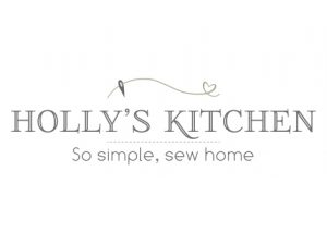
Holly’s Kitchen


In April 2017, Laura asked me if I would help her create a lovely new logo for her business. Laura makes soft furnishings and fabric gifts by hand and so her new logo needed to not only represent this, but also the fact that all her products are bespoke and made to measure giving her customers the ability to choose fabric, colour and of course size too. Laura is also an advocate of giving a real personalised service where she is with you every step of the way too.
Laura wished for her brand to have that ‘country kitchen’ feel so we decided on a really nice and charming colour palette of ivory, dark grey and sage green. Now it was a case of bringing the brand to life. Within the first couple of concepts I presented to Laura, I had considered some holly leaves as part of the logo symbol, but in the end they looked a bit too abstract in the sense of what the brand was all about and it needed to say more ‘hand made’.
I developed the designs further and explored using a needle and thread in the design to really show that hand made element, but I also wanted to get across the service Laura gives and how everything is loving made. So, with that in mind, I decided to create a line of thread with a heart in the middle, giving it that free flowing look with a needle on the end.
“Simple, clean and says sewn with love. I’m quite sad to leave the holly behind but I think the “thread” ticks all the boxes (some of them I didn’t even know I had!)” – Laura Hutchinson, Holly’s Kitchen.
Once the logo was finalised I went on to design a thank you for your order card and business card for Laura.

