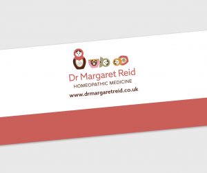
Dr Margaret Reid


In February 2017, I was recommended to Dr Margaret Reid by a client of mine and also a business colleague who I work closely with if a client is in need of a website design. Margaret is a medical doctor practicing homeopathy and has over 30 years experience working as a GP within the NHS and so this became one of Margaret’s USPs for her brand. With homeopathy experience under her belt too, Margaret knew she wanted to provide a high level of care within her home environment helping people feel at ease in an instant.
When it came to the initial logo designs for Margaret I looked at three concepts:
1. Daisies because Margaret’s name meant daisy and it can be used as a remedy too.
2. Agapanthus flowers as these were Margaret’s favourite.
3. Russian dolls to show the layers of wellbeing and health.
After some tweaking the logo was finalised and the Russian doll concept was the winner. I incorporated lots of complimentary colours to match Margaret’s homely interior but the colours I used were also calming, warm, inviting and holistic.

