I help clients with their branding – getting it to look right, feel right and give off the right message too.
So, it got me thinking about my own branding and I thought I would explain to you the meaning behind my own logo.
When I was 20, in my second year at college doing my Graphic Design degree, we were given a new project to work on. We were asked to brand ourselves – so to come up with a logo that said it was us!
The first protocol was to do some research and sketch out some ideas. The second – to bring those ideas to life on the mac.
My final brand looked like this:
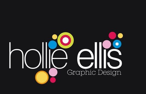
Every logo that is designed has to have a concept behind it… I wanted my brand to show the qualities I have as a person: bubbly, happy and smiley but also an all-rounder professionally with my skills, showing my versatility. I also wanted it to be recognisable.
When I was made redundant from my job, I instantly decided to go freelance. It was time to look at my brand and I decided I wanted to keep what I had originally done back at college, but just tweak it a little.
I decided a cleaner brand was needed, so I changed the text to black and the background to white… I took graphic design out, knowing that I would be offering more than just design and I added a line in to make it stand out a bit more. This was the end result:
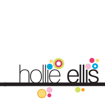
I’ve always said brand consistency is a key factor for any brand and I wanted to achieve this with my brand too. So any branding I do, incorporates the bright coloured circles, which are recognised, even without any words needing to be there – see the comment below. And that’s even with the colours changed to a ‘halloween’ colour palette.

So my question to you is, is your brand instantly recognisable too? Is it consistent? Do you know what your brand stands for? The meaning and concept behind it?
I’d love to know your thoughts.
You can get in touch with me by emailing me: office@hollie-ellis.co.uk or via twitter: @ellishollie and facebook: Hollie Ellis Design.
